


Quake Metallic Stylus Ballpoint Pen
A Giveaway Pen That Earns a Spot on Every Desk
When your brand lives in someone's hand every day, the pen you choose matters more than most marketing budgets account for — and the Quake Metallic Stylus Pen is built to hold that position.
Most promotional pens look fine in a catalog photo and feel forgettable the moment someone picks one up. Flimsy barrels, skipping ink, and logos that fade after a week do nothing for your reputation. You need a giveaway that clients actually keep, not one that migrates straight to the bottom of a bag.
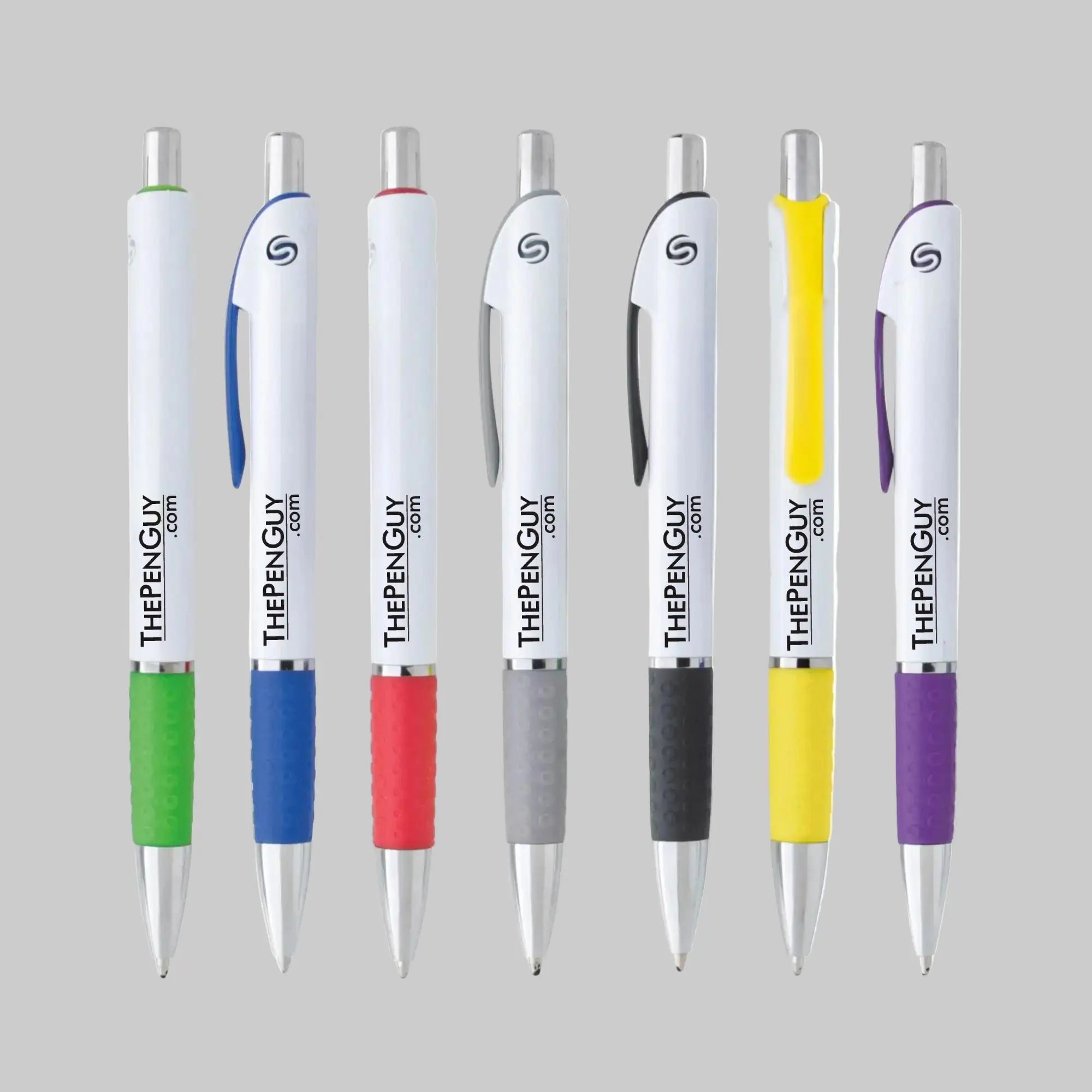
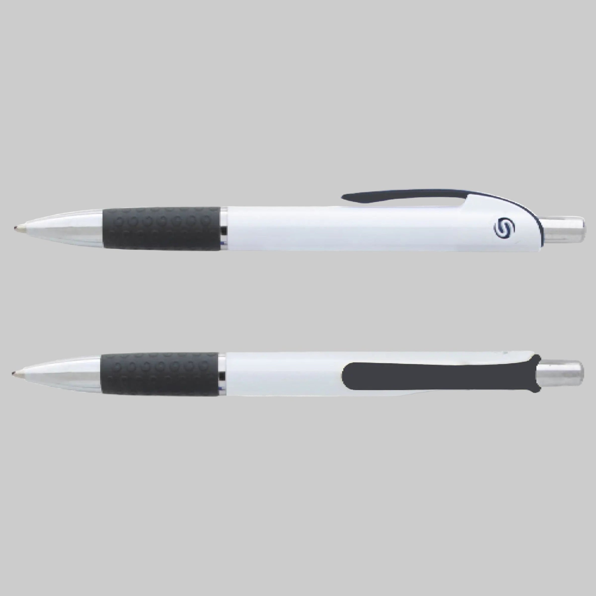
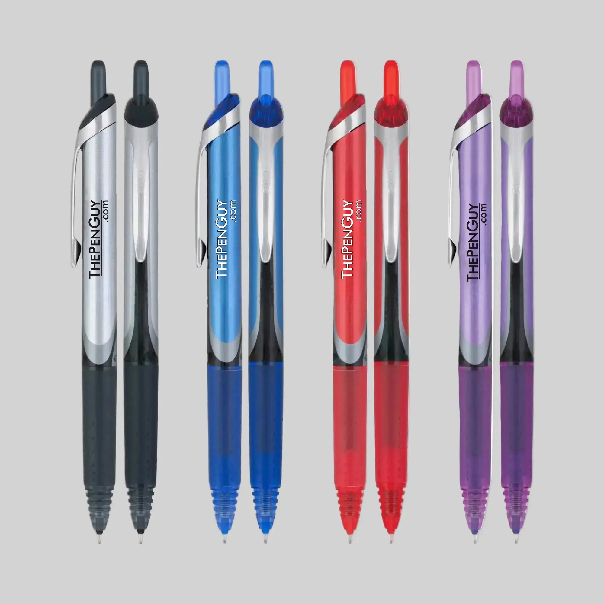
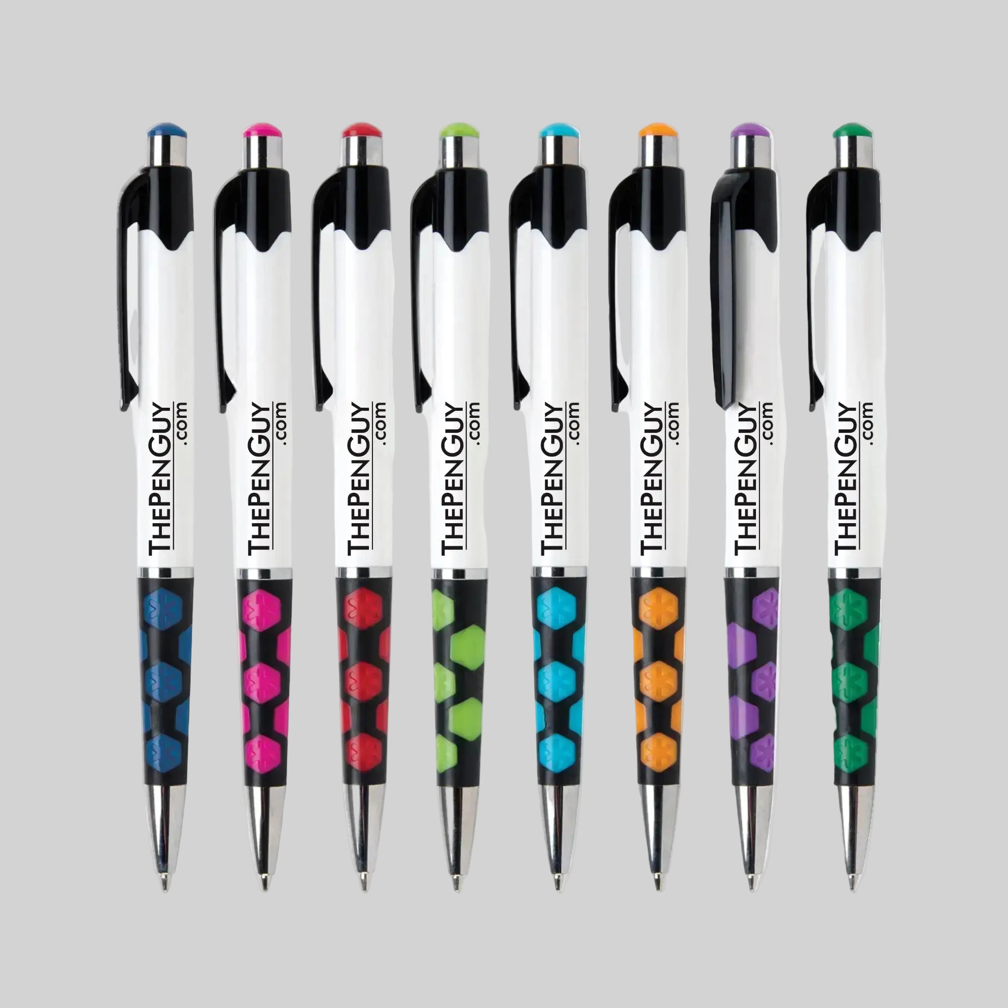
The Quake is a solid answer to that problem. Ordering custom imprinted stylus pens in bulk through us means you get a gloss metallic barrel, a shattered-pattern rubber comfort grip that feels secure in hand, and a dual touchscreen stylus and ballpoint pen function that gives clients a real reason to reach for it twice a day. Your logo is applied via a one-color one-location silkscreen logo print, crisp and durable, across a 1.75" × 0.75" imprint area. With your choice of black or blue ballpoint ink cartridge, it writes smoothly from the first signature to the hundredth.
Technical Specifications
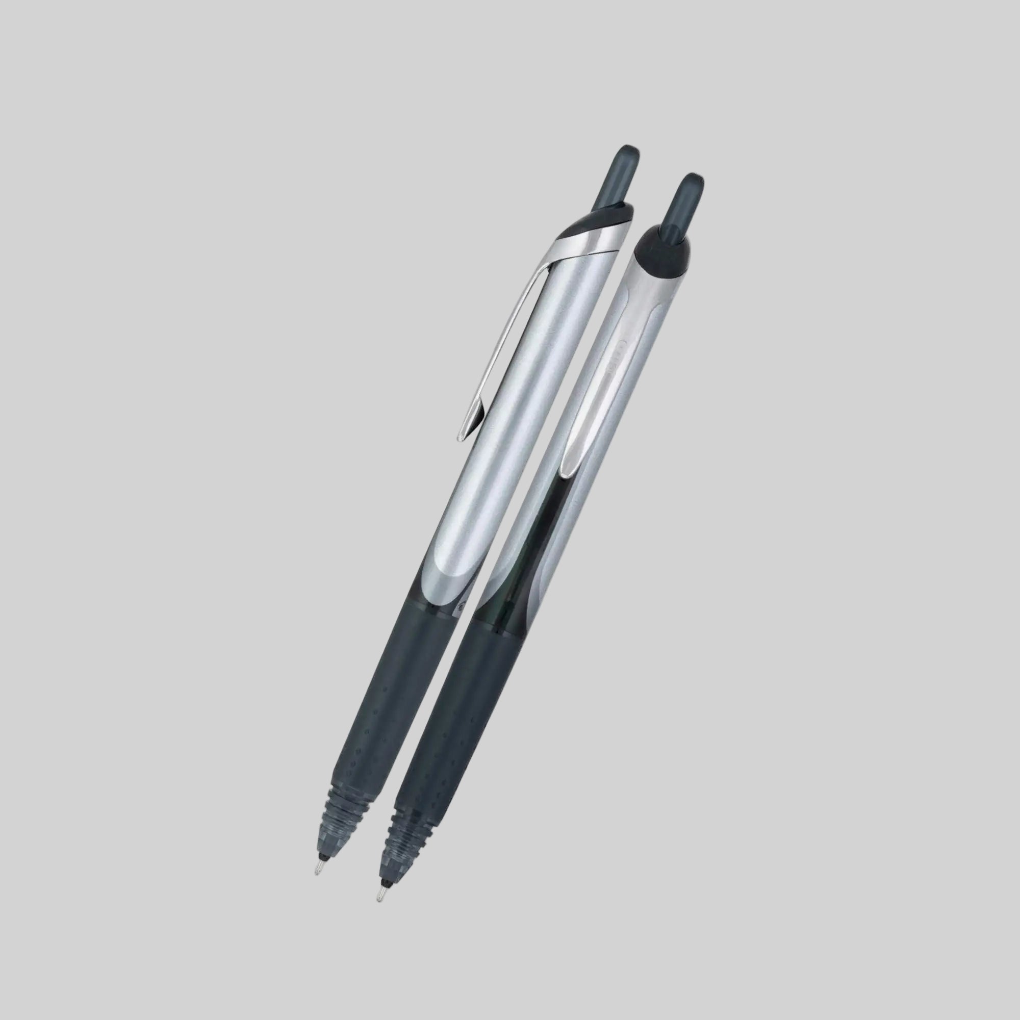
- Material: Durable plastic body with a gloss metallic finish
- Dual Function: Responsive stylus tip for all touchscreens plus smooth ballpoint writing
- Ink: Black or blue ballpoint ink cartridge, your choice at time of order
- Grip: Shattered-pattern rubber comfort grip for a secure, non-slip hold
- Imprint Method: One-color, one-location silkscreen logo print included in price
- Imprint Area: 1.75 inches wide by 0.75 inches high
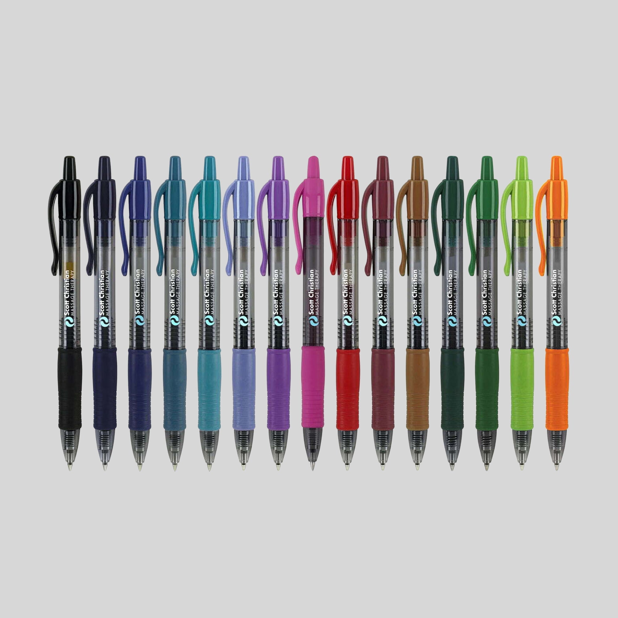
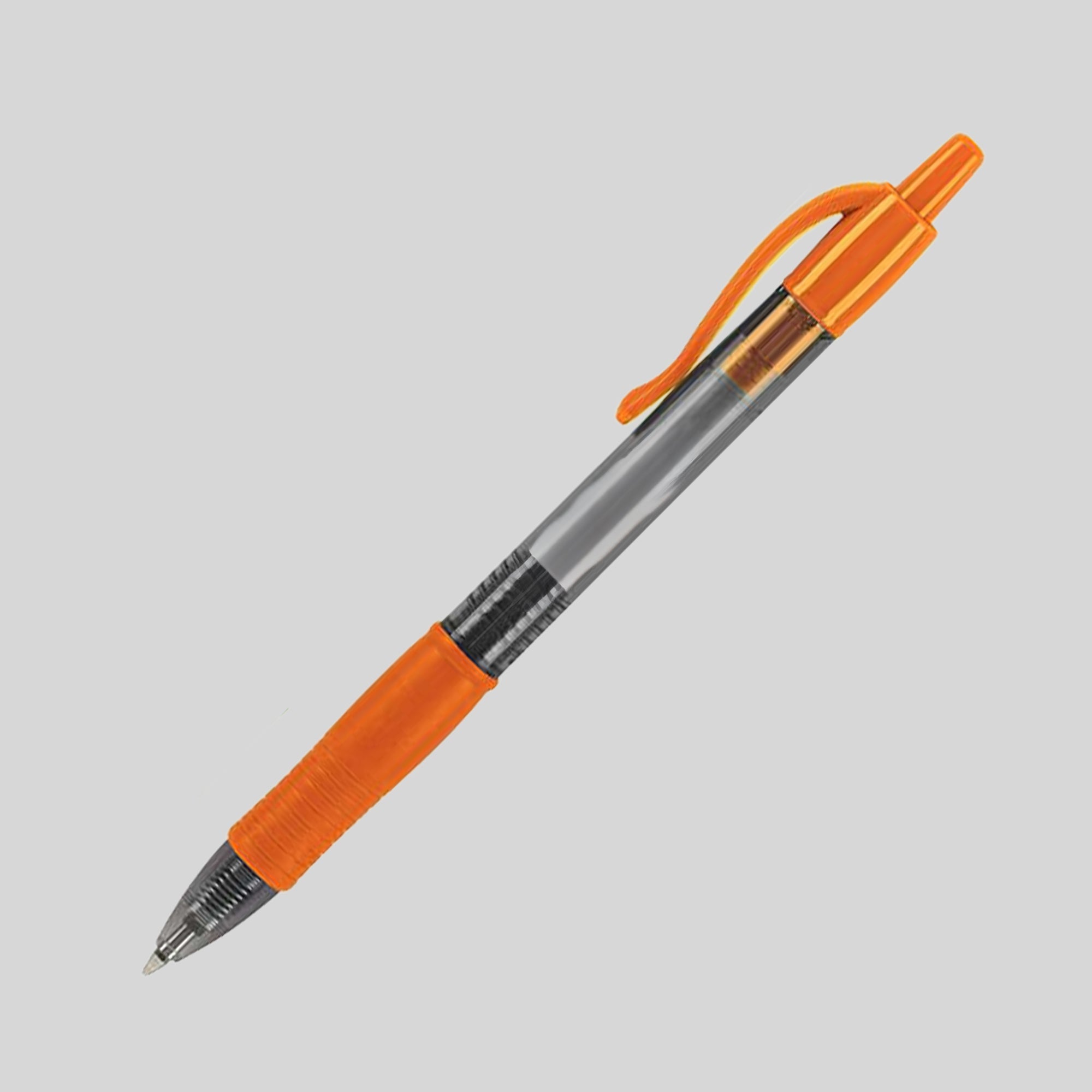
- Barrel Colors: Multiple rich colors available to match your brand identity
- Packaging: Bulk-shipped to reduce waste and keep your per-unit cost low
- Best For: Trade show giveaway pens, client meeting and proposal signing gifts
The minimum order quantity is 250 units, keeping the Quake accessible without locking you into warehouse quantities. Whether you are heading into a trade show, a client meeting, or a proposal signing, this pen shows up ready to work. Request your quote or place your order today to get your logo into your clients' hands before your next event.
Explore our full range of custom stylus pens for more options.
Anatomy of a Custom Pen
Choosing the right pen construction ensures your promotional giveaway looks professional, functions flawlessly, and stays in your customers' hands.
- The Essentials: A pen is built from core structural components—like the barrel (your main design real estate) and the ink style (ballpoint, gel, or rollerball), which dictates how smoothly it writes.
- The Accents: Secondary details like ergonomic grips, structural trim, and secure clips add both comfort for the writer and vibrant color-matching opportunities for your brand.
Dive into a pen's anatomy with our full guide: The Anatomy of a Custom Pen.
Artwork Resolution & File Formats
Because custom pens offer a compact printing canvas, standard web images (like JPG or PNG) can become blurry or jagged when scaled down.
- Required Formats: Please submit your corporate logo or text in a vector format, specifically .EPS or .SVG.
- Why it matters: Vector files use mathematical coordinates rather than pixels. This allows our printing equipment to scale your graphics down infinitely without losing a single pixel of crispness, ensuring fine lines.
That being said, feel free to send over whatever you have ready and our team will take it from there!
Exact Color Matching (PMS Colors)
When trying to align the Trim Color or accent pieces of a pen with your strict corporate identity, guessing the shade isn't an option.
- The System: We utilize the Pantone Matching System (PMS) to guarantee precision.
- How to use it: When submitting your design requirements, specify your brand's unique PMS color codes if you know them. This ensures the ink imprint on the barrel or the selected plastic trim matches your official company colors perfectly.
Don't fret if you don't have that information. We will do our best to match the colors!
Font Legibility & Minimum Sizes
The Clip Imprint (Clip Imp) area is an incredibly high-visibility spot for phone numbers or taglines, but it offers highly limited real estate.
- Font Choice: We recommend using clean, sans-serif fonts (like Helvetica, Arial, or Futura) for high-contrast legibility. Avoid intricate script or cursive fonts in this area.
- Minimum Size: Any text placed on the clip must be a minimum of 6 pt font to prevent the ink from filling in the loops of letters like e, o, or a. If you're squeezing a long URL onto the clip, consider using the main barrel instead to keep it readable at a glance.
- If you have any questions, feel free to contact us first.