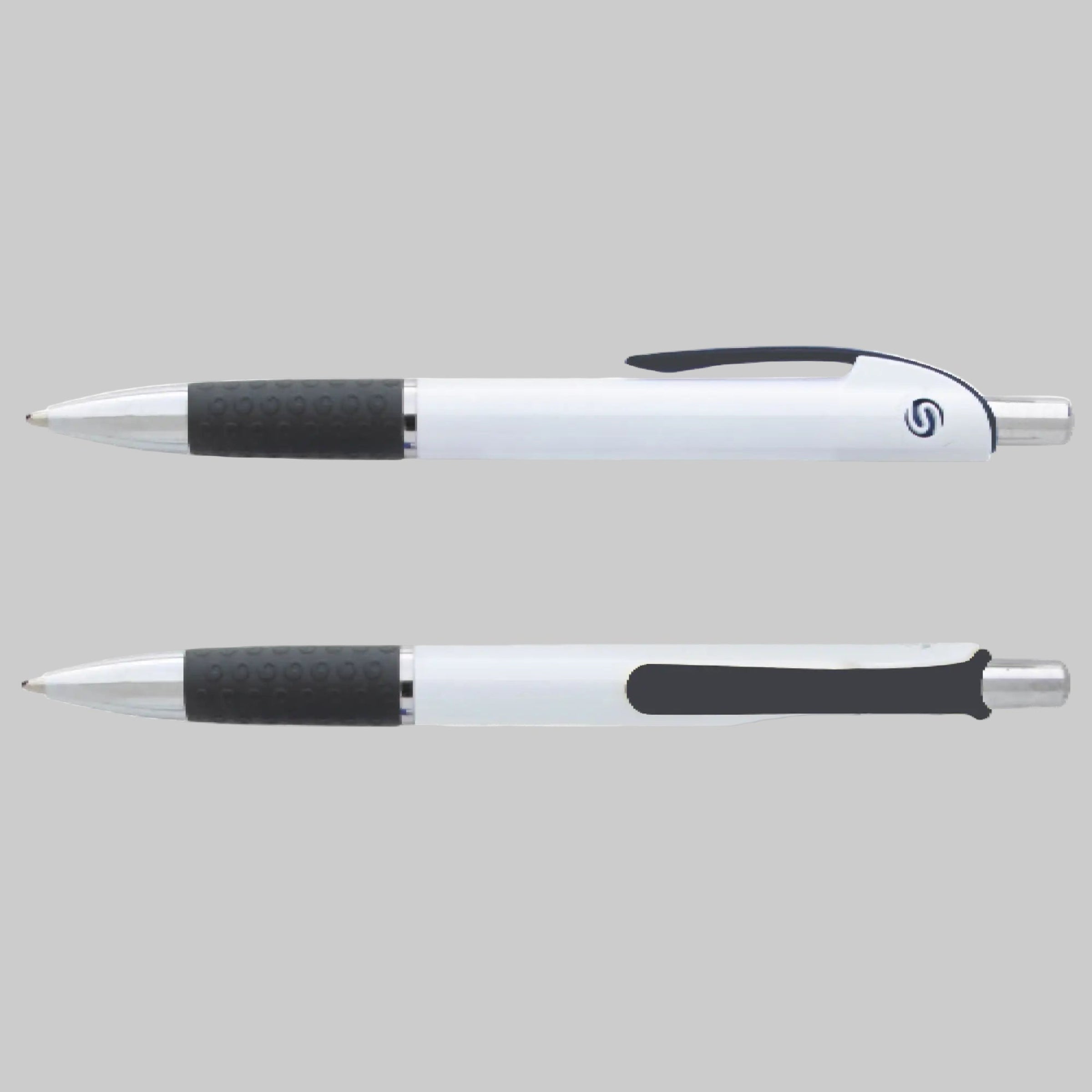
Ultra Oak Retractable Ballpoint Pen
The Pen Your Brand Leaves Behind Long After the Event Ends
A pen that writes well enough to keep on a desk is a pen that keeps your logo in front of someone every single workday.
Most trade show giveaway pens get tossed within days because they skip, feel hollow in the hand, or bleed through the cap onto a shirt pocket.
When that happens, your company name does not get remembered for generosity — it gets associated with the inconvenience.
The Ultra Oak Promotional Pen is built differently: a ballpoint retractable pen design with black ballpoint ink with a replaceable refill means recipients are not throwing this one away when it runs dry, and ordering Ultra Oak custom imprinted pens in bulk starts at just 250 pieces so HR teams can have new hire orientation supplies ready for every onboarding class without committing to warehouse quantities. A screen printed logo imprint lands cleanly on the white barrel, and the pen's balanced weight and firm grip make it a natural choice for daily note-taking at a corporate desk, not just a trade show table. The smooth, consistent ink flow is the reason people reach for this one again the next morning instead of leaving it in a conference room.
Product Specifications
- Ink Type: Black ballpoint
- Refill: Standard replaceable ballpoint refill
- Pen Style: Retractable ballpoint with comfortable grip
- Decoration Method: Screen print
- Imprint Area: 1½" W × ¾" H
- Barrel Color: White
- Clip Colors Available: Purple, black, burgundy, green, red, or blue
- Minimum Order Quantity: 250 pieces
- Packaging: Bulk standard packaging
- Country of Origin: Made in the USA
Starting at just 250 units, this is a practical order size for a single department, a regional event, or a quarterly onboarding class. Get a quote or place your order today at The Pen Guy.
Explore our full range of custom promotional pens for more options.
Anatomy of a Custom Pen
Choosing the right pen construction ensures your promotional giveaway looks professional, functions flawlessly, and stays in your customers' hands.
- The Essentials: A pen is built from core structural components—like the barrel (your main design real estate) and the ink style (ballpoint, gel, or rollerball), which dictates how smoothly it writes.
- The Accents: Secondary details like ergonomic grips, structural trim, and secure clips add both comfort for the writer and vibrant color-matching opportunities for your brand.
Dive into a pen's anatomy with our full guide: The Anatomy of a Custom Pen.
Artwork Resolution & File Formats
Because custom pens offer a compact printing canvas, standard web images (like JPG or PNG) can become blurry or jagged when scaled down.
- Required Formats: Please submit your corporate logo or text in a vector format, specifically .EPS or .SVG.
- Why it matters: Vector files use mathematical coordinates rather than pixels. This allows our printing equipment to scale your graphics down infinitely without losing a single pixel of crispness, ensuring fine lines.
That being said, feel free to send over whatever you have ready and our team will take it from there!
Exact Color Matching (PMS Colors)
When trying to align the Trim Color or accent pieces of a pen with your strict corporate identity, guessing the shade isn't an option.
- The System: We utilize the Pantone Matching System (PMS) to guarantee precision.
- How to use it: When submitting your design requirements, specify your brand's unique PMS color codes if you know them. This ensures the ink imprint on the barrel or the selected plastic trim matches your official company colors perfectly.
Don't fret if you don't have that information. We will do our best to match the colors!
Font Legibility & Minimum Sizes
The Clip Imprint (Clip Imp) area is an incredibly high-visibility spot for phone numbers or taglines, but it offers highly limited real estate.
- Font Choice: We recommend using clean, sans-serif fonts (like Helvetica, Arial, or Futura) for high-contrast legibility. Avoid intricate script or cursive fonts in this area.
- Minimum Size: Any text placed on the clip must be a minimum of 6 pt font to prevent the ink from filling in the loops of letters like e, o, or a. If you're squeezing a long URL onto the clip, consider using the main barrel instead to keep it readable at a glance.
- If you have any questions, feel free to contact us first.